
In the current digital age, with smartphones being connected to our phones and our phones being constantly connected, having a responsive website that functions seamlessly with all mobile devices isn’t more a luxury; it’s a necessity. Do you realize that nearly 60% of web traffic is generated by mobile devices? If your site isn’t mobile-friendly, you’re missing out on the potential for customers, interaction and even revenue.
At SUM Group, we specialize in developing responsive websites that quickly adapt to any screen size and ensure customers get the most enjoyable experience. We’ll look at the importance of responsive design in the first place and how it can benefit your business’s standing in a mobile-first society. Let’s take a look!
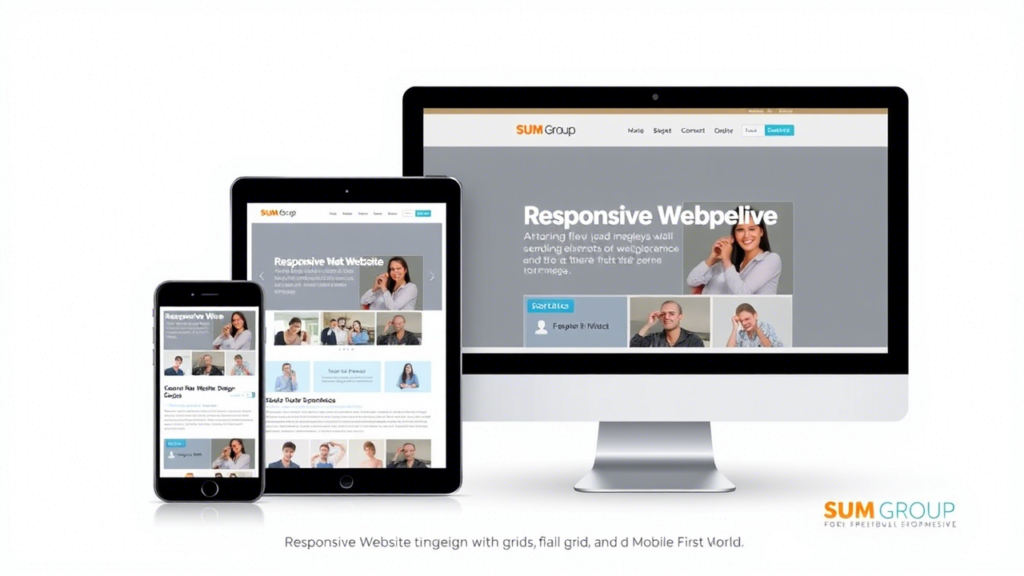
What Is Responsive Website Design?
Responsive design for websites by SUM Group ensures that your website appears and performs flawlessly on tablets, desktops and mobile phones. It uses various layouts and images along with CSS media queries to alter the content based on the user’s device.
This is the reason why it’s so effective:
- Fluid grids: Content scales proportionally to accommodate different sizes of screens.
- Flexible images: Images can be scaled without distortion or problems with overflow.
- Media queries: Code detects the type of device and adjusts to match.
Consider it like making a perfect dress whether sitting, standing, or moving about.
Why Is Responsive Design Crucial in a Mobile-First World?
1. Mobile Traffic Dominates the Web
The majority of users indeed browse the web on their smartphones. From checking email to purchasing online, smartphones are the preferred convenient device. If your website isn’t loading fast or well on smaller screens, users will leave quicker than you can describe as a “bounce rate.”
Essential figures to take into account:
- More than 50% of users will never visit mobile websites that aren’t well-designed.
- A slow-loading page could cause you to lose more than 53% of mobile users.
2. Google Prefers Responsive Websites
Google is a fan of responsive design, and you should, too! From 2015 onwards, Google has been putting a premium on mobile-friendly websites when ranking its search results. These sites that are not responsive will be punished with less visibility, making it difficult for prospective customers to find you.
Advantages of being mobile-friendly
- Better search engine ranking.
- More organic traffic.
- Improved user experience signals (like the time spent on the website).
3. Enhanced User Experience = Higher Conversions
A responsive website doesn’t just have to be about appearance. It’s about providing an easy, enjoyable experience if visitors can navigate easily or read and engage with your website. They are more likely to be on the site longer and take action, whether by signing up, buying, or contacting you.
Effect on conversions
- More Usability can lead to greater trust and confidence.
- Streamlined navigation reduces cart abandonment rates.
- Speedier loading times increase the overall experience.
How Responsive Design Benefits Your Business
Cost Efficiency
Maintaining your website’s separate mobile and desktop versions could be costly and lengthy. By using responsive designs, you will only require one version that automatically adapts to any device. This reduces the need for resources and keeps your branding constant.
Future-Proofing Your Website
Technology changes rapidly, and new devices with screens of varying sizes constantly appear. Responsive design will ensure your site is compatible with the latest innovations without regular updates.
Competitive Edge
If your competitors already use responsive design, lagging could result in losing market share. However, using responsive practices will position you as a forward-thinking brand dedicated to providing value to your customers.
Tips for Creating a Truly Responsive Website
For the most significant effectiveness from your design that is responsive, be aware of these guidelines:
- Prioritize speed: Optimize images, use caching, and reduce code to guarantee fast loading times.
- Make navigation simpler. Utilize collapsible menus and simple CTAs to assist users quickly.
- Test across devices regularly: Test how your website performs across screens of different, improving user experience and ensuring that the text is readable without zooming and that the buttons are large enough to tap comfortably.
Conclusion Keep Up by Using Reactive Design
In this mobile-first age, responsive web design isn’t just a fashion but a necessity. When you invest in a responsive website, you’re enhancing the users’ experience, increasing SEO and conversions, and keeping ahead of your competitors.
In SUM Group, we understand the importance of creating highly optimized websites that function seamlessly across all devices. If you’re starting out or re-designing your existing website, Our team is ready to help you build an online presence that shines.
Your Turn: Take Action Today!
Don’t let the outdated design of your website slow your business down. Are you ready to transform your site into a mobile-friendly and powerful tool? Get in touch with SUM Group today for expert assistance and tailored solutions.